(copywriting, branding, illustration, print layout, packaging, web layout)
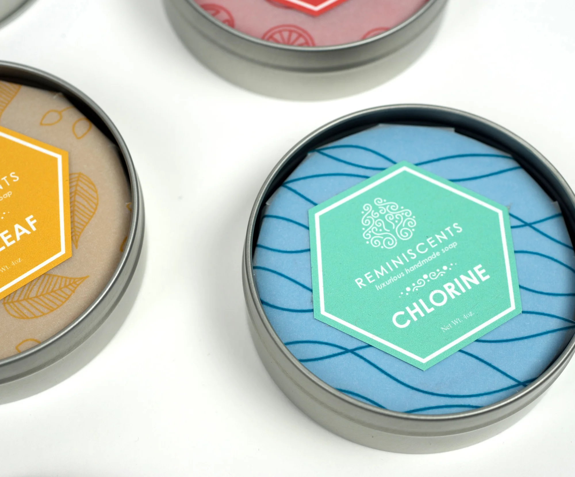
For my senior thesis, I chose to explore one of my passions of psychology and more specifically the theory that memory is strongly linked to our senses. I researched scents commonly associated with strong childhood memories. These include fresh cut grass and chlorine and designed a brand identity around this concept. Loose threadlike patterns were incorporated as well as the hexagonal chemical compound shape representing the brain paths and chemical reactions that allow this phenomenon to occur.
Art Direction: Paul Kepple
Photography: Austen Hart
Recognition: Featured on DesignIdeas.pics
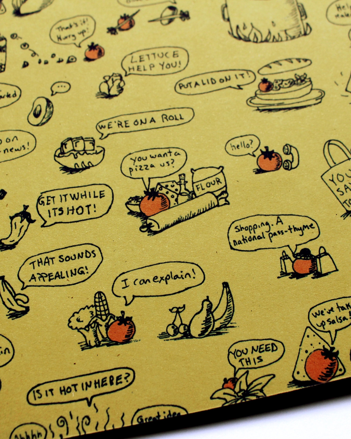
(branding, illustration, print layout, packaging)
You Say Tomato (or tomāto whichever you prefer) is a corporate redesign of an existing company. I discovered this charming cafe when living in Kansas City for a summer. The existing brand didn’t accurately portray the place’s charm and attitude. I updated the brand identity by adding plenty of puns, hand drawn elements, and warm colored papers that convey You Say Tomato’s natural business values.
Art Direction: Alice Drueding
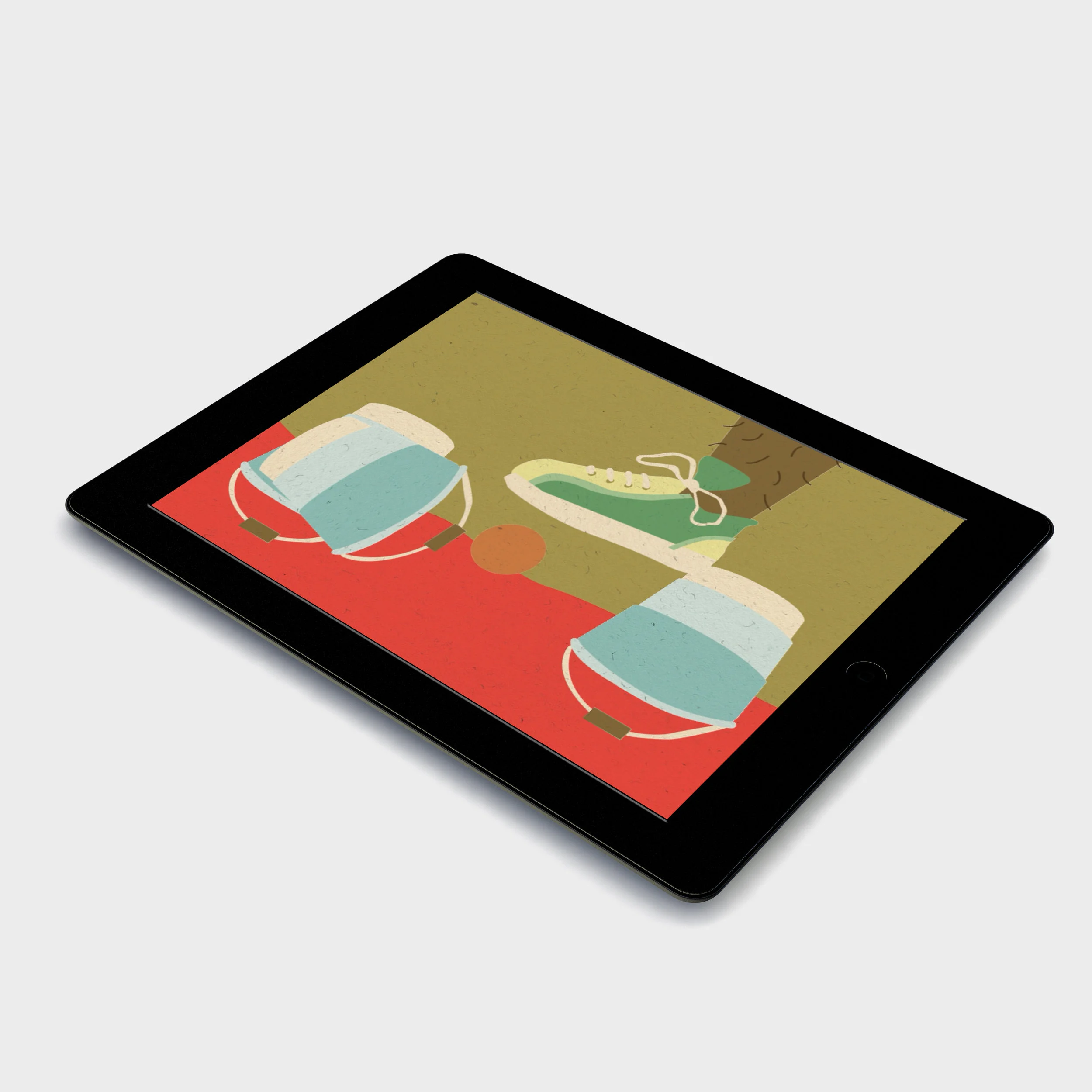
(app design, animation, apparel)
Mourning Glory is an interactive and immersive digital publication app geared towards children ages 8-12. Its goal is to familiarize the audience from a young age with the abstract concept of death. As someone who experienced death as a young person, I have always been fascinated by the vastly different ways in which people handle the topic, or more commonly, avoid it completely. This particular issue of the publication focuses on 3 vastly different, yet universally positive cultural practices during the mourning process. I also designed advertisements and games to play between each of the animated articles.
Art Direction: Scott Laserow
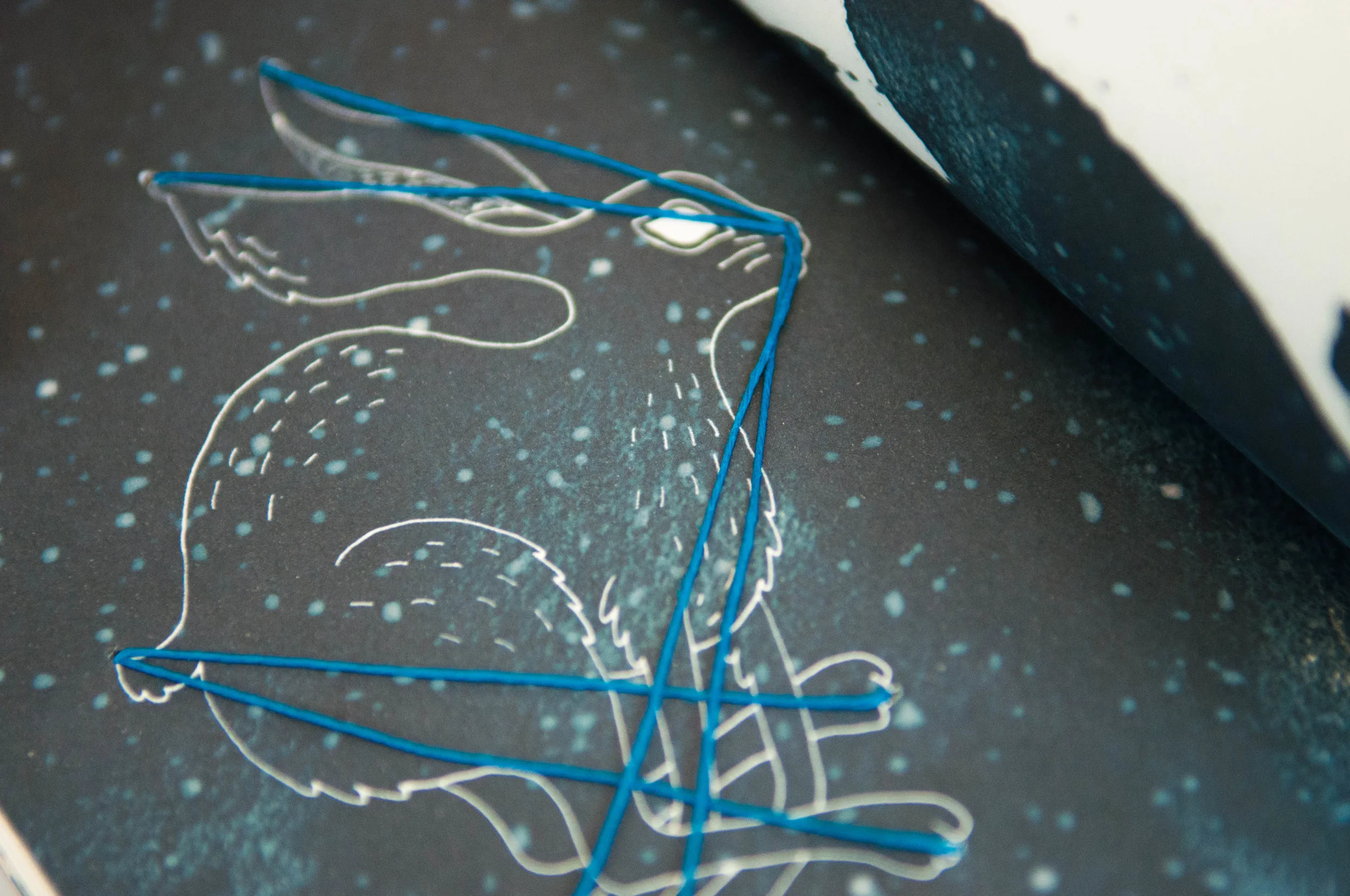
(branding, hand stitching, illustration, print layout, poster design)
For this project, I was prompted to create an event based around one of the fifty states in the U.S. I chose to highlight the important and culturally rich astrological traditions of the Navajo in Arizona. I achieved this through the creation of promotional material for stargazing events based around the four sacred mountains of the Navajo. I included brief summaries of each constellation’s story in the booklets. To complete the identity, the books are handsewn to reference the deep thread of these stories within the Navajo community as they are passed down and interwoven within the culture.
Art Direction: Dustin Summers
Photography: Colleen DeMenna
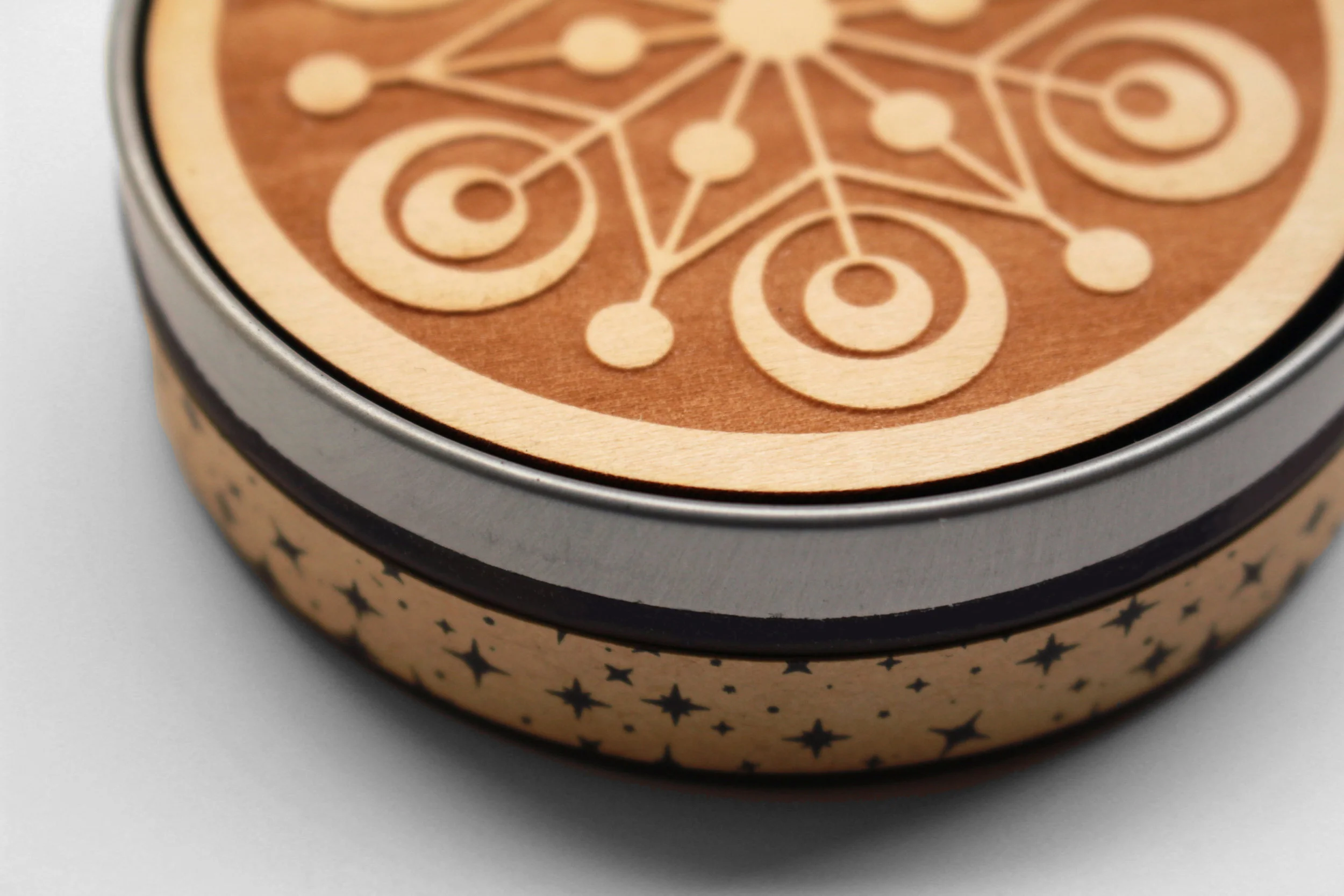
(entrepreneurship, packaging, product design)
Oh Crop! Is a series of coasters inspired by the mysterious and unique art of crop circle making. The inspiration grew from the all too familiar link between tales of alien abductions and the outrageous claims people sometimes make when they’ve had one too many to drink. The designs are created symmetrically as to be viewed from all sides not matter which way you turn it and are lasercut out of wood with varying finishes. The backing is fixed with fake grass as to provide a no slip surface and prevent those unfortunate spills that just might make you say “Oh Crop!“
Art Direction: Bryan Satalino & Kelly Holohan
Photography: Colleen DeMenna
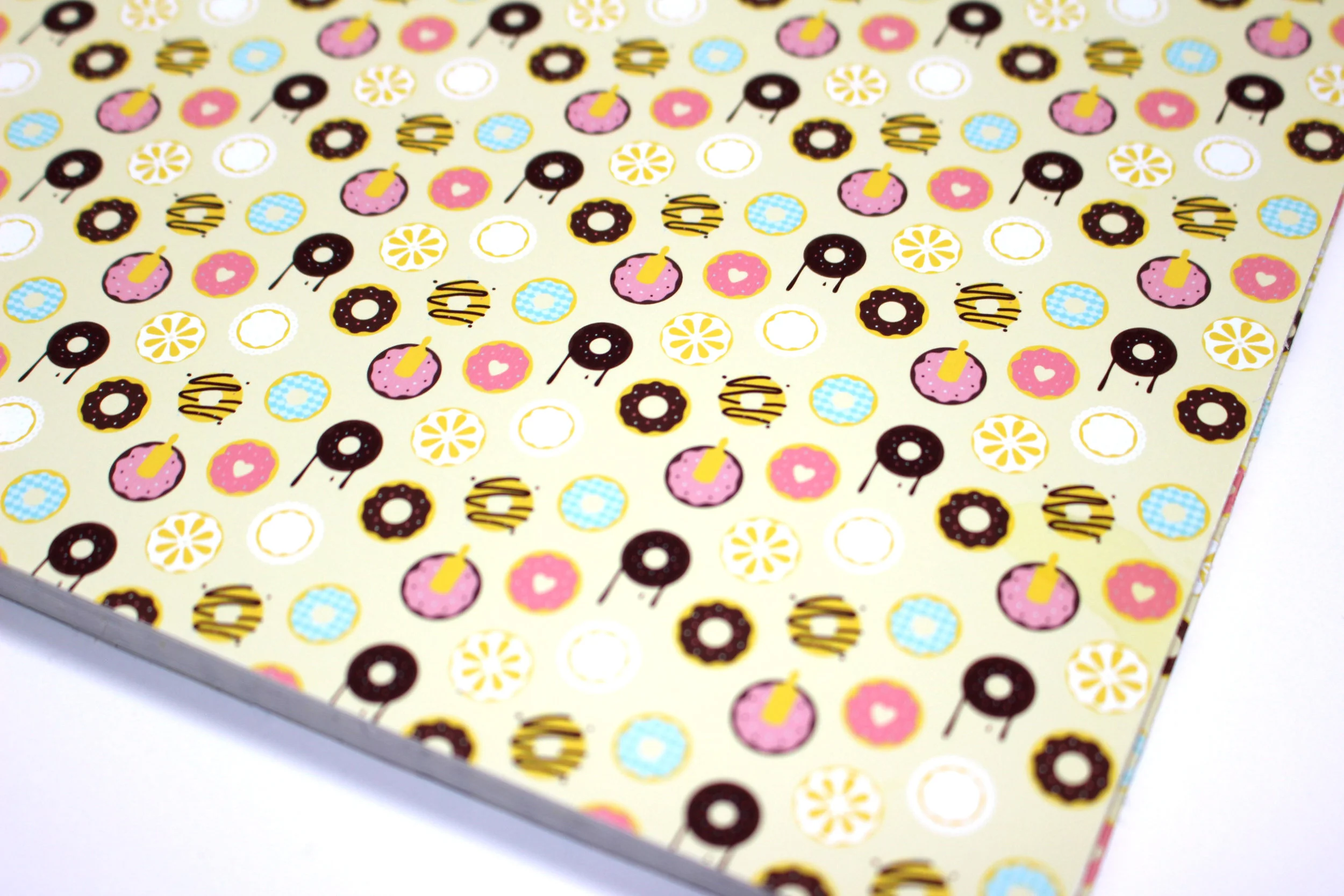
(copywriting, branding, print layout, packaging, web layout)
Donut Disturb is a fictional donut shop specializing in donut flavors that are adult in nature, with all the fun and creativity of a cheeky humorous shop. The menu is in the shape of a classic privacy sign hung from a doorknob and folds out into an accordion to showcase all 8 delicious and suggestive categories of pastries. The identity includes custom packaging including a carry out bag as well as varying sizes of boxes complete with Donut Disturb logo hangtags. The restaurant also includes products for sale including sprinkles, whisks, spatulas, measuring spoons, and an apron embroidered with the identity logo.
Art Direction: Scott Laserow
Recognition: 2nd Place Overall Identity
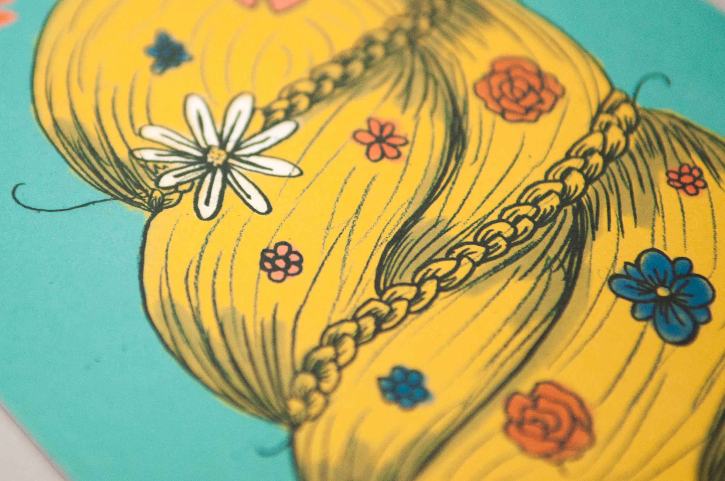
With a new year and/or month comes the need to reinvent yourself. Tasked with creating a versatile promotional calendar, I chose to focus on how different hair care products allow anyone to redefine their image simply by changing their hair. To do this, the calendar comes complete with a wooden stand with a laser cut image of a woman's head with changeable monthly cards featuring a different hairstyle relating the the specific month. The designs are quirky, fun, and most importantly show the endless possibilities of what a new look can (hair) 'do.
Art Direction: Mary Kate McDevitt
Photography: Colleen DeMenna
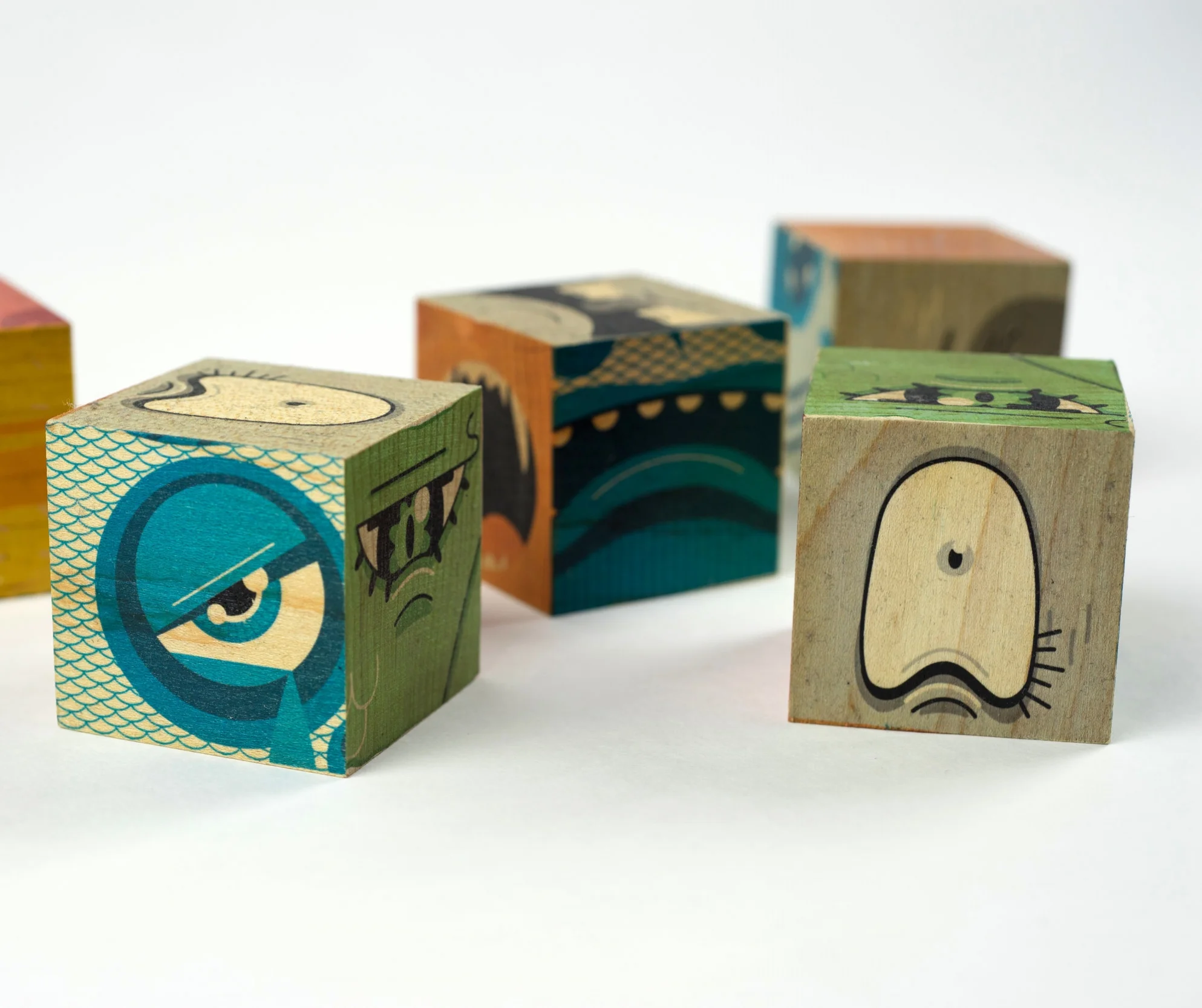
(branding, entrepreneurship, packaging, product design)
Moodsters ia a collaborative project with 3 fellow students to create a series of blocks marketed to children to help with emotional face recognition. The process included designing the six block faces, mocking up the faces onto wooden blocks, and developing an efficient and profitable business model to produce the blocks to be sold at the Hatchery Design Incubator, the Tyler School of Art’s new design market.
Credits: Joe Wanovich, Maddie Persson, & Cassandra Reffner
Art Direction: Bryan Satalino
Photography: Austen Hart
(illustration, packaging)
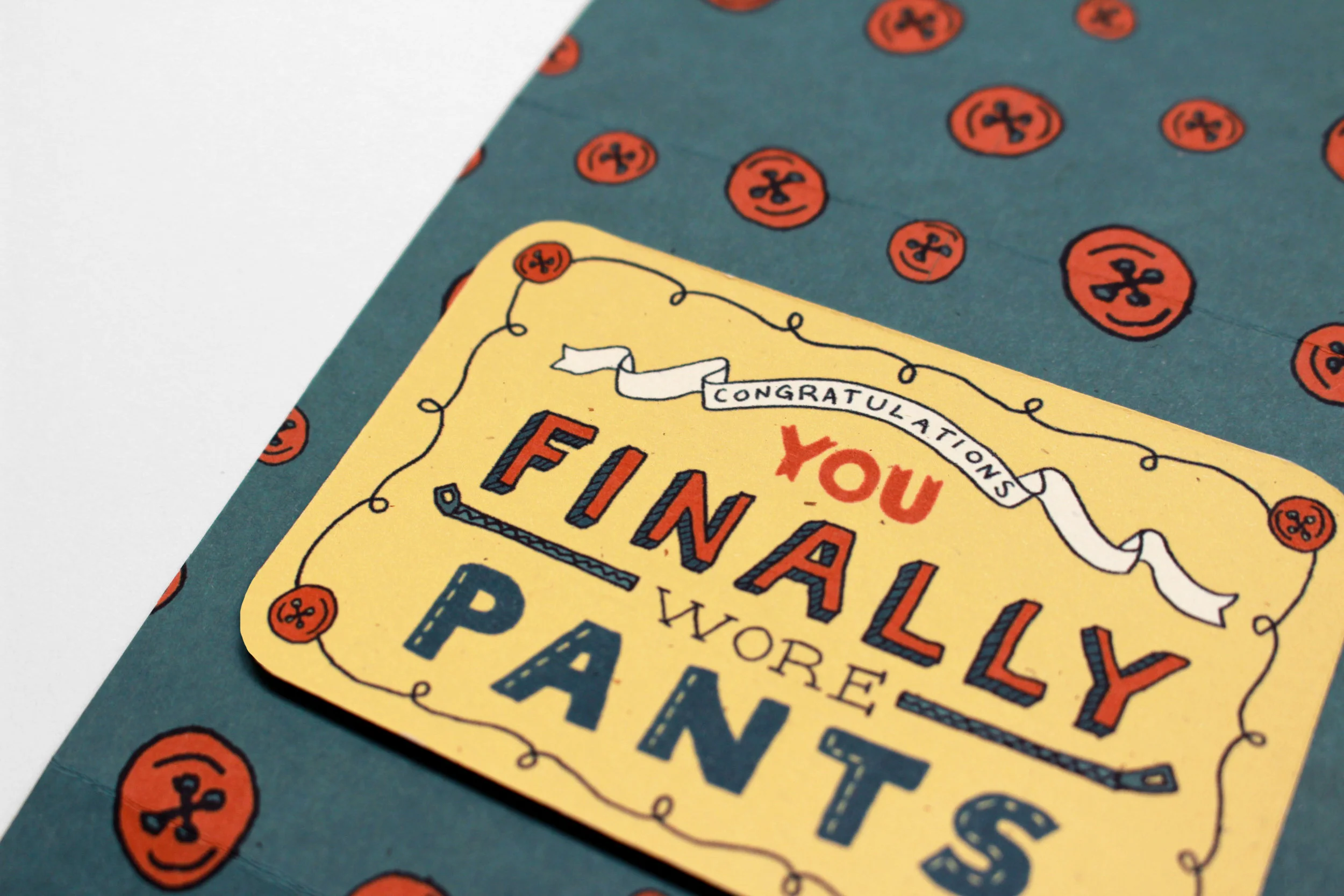
These gift cards for Target celebrate the small adult achievements that we all should be doing already. These gift cards are meant to offer a little push of encouragement. The topics center around doing the dishes, putting on actual button and zipper pants, and eating something that is green (without the addition of green food coloring). They all are hand drawn to evoke the sense of being made by a friend. Each card comes in a sleeve that states an encouraging phrase which opens up to reveal the award.
Art Direction: Mary Kate McDevitt
Photography: Colleen DeMenna